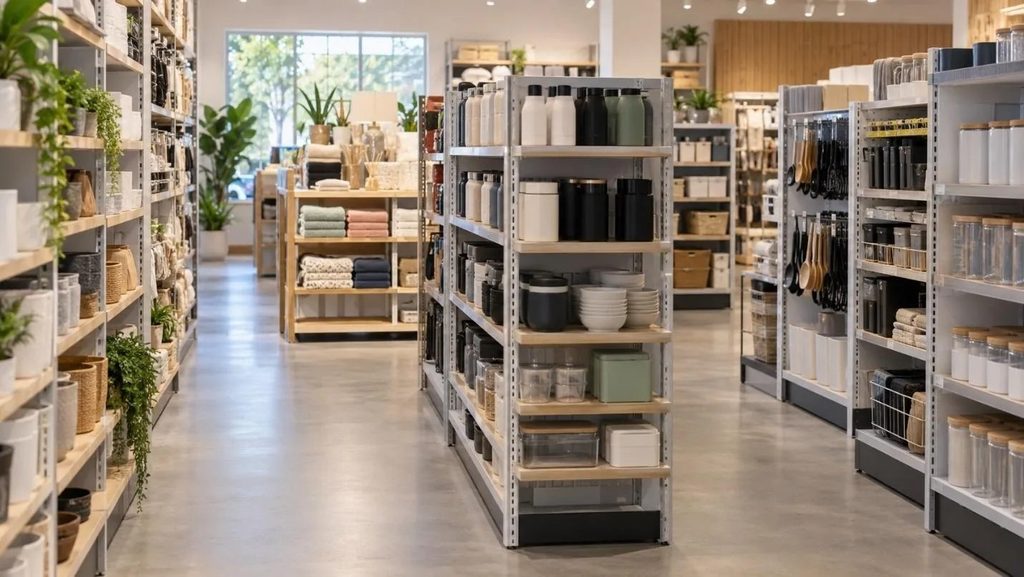
A good store layout helps customers find products, compare options and move towards a purchase without unnecessary effort. A poor layout does the opposite. It hides merchandise, creates congestion and makes the store difficult to understand.
These problems do not always require a complete refurbishment. In many cases, retailers can improve product visibility and sales by correcting a few common layout mistakes.
1. Using Shelving That Does Not Suit the Products
Shelving should match the size, weight and packaging of the products being displayed. When shelves are too deep, small items can disappear towards the back. When the vertical spacing is excessive, products may look sparse. Shelves positioned too closely together can make stock difficult to see and reach.
The fixture itself should support the way customers shop. Products that require comparison need enough room for shoppers to view several options at once. Frequently purchased items should be easy to reach, while heavy merchandise should generally remain on lower levels.
Adjustable retail shelves allow stores to change shelf heights and display configurations as their product range develops. This helps retailers avoid being locked into a layout that only works for their current inventory.
2. Overcrowding Product Displays
Displaying more stock does not automatically create more sales. When too many products compete within one area, individual items become harder to notice.
Overcrowded displays can create several problems:
- Product labels and prices become difficult to read.
- Different categories start to blend together.
- Promotional items lose their visual impact.
- Customers require more time to compare their options.
- Shelves can appear disorganised even when they are fully stocked.
Retailers should create clear product groupings and leave enough space for each range to remain visually distinct. Additional inventory can be stored elsewhere and used to replenish the display as required.
The objective is not to make shelves look empty. It is to give customers enough information and choice without overwhelming them.
3. Placing Priority Products Outside Natural Sightlines
Products positioned too high, too low or behind other merchandise are easier to overlook. This is particularly costly when the hidden items are new, seasonal or high-margin products.
Eye and hand level are usually the most valuable display positions because customers can notice and reach products with little effort. However, these positions should be assigned deliberately. If every product is presented as a priority, none of them will receive meaningful emphasis.
Retailers can use prominent shelf positions for:
- Bestselling products
- High-margin lines
- New releases
- Seasonal merchandise
- Products included in current campaigns
- Items that encourage additional purchases
Lower and upper shelves remain useful for larger packages, reserve stock and products customers already expect to find. The placement strategy should reflect both commercial priorities and customer behaviour.
4. Blocking Sightlines Across the Store
Customers should be able to understand the general structure of a store shortly after entering. Tall fixtures, stacked cartons and oversized displays can block views of important categories, service areas and promotional sections.
Blocked sightlines also make smaller stores feel more enclosed. Customers may assume they have seen the entire range when additional products are simply hidden behind fixtures.
Lower displays can be used near entrances, major intersections and central areas to preserve visibility across the store. Taller shelving is generally better suited to perimeter walls or carefully planned aisle runs.
Retailers should stand at the entrance and at several points along the main customer path. From each position, they should check whether shoppers can see:
- Major product categories
- Promotional displays
- Service counters
- Checkout areas
- Directional signage
- Routes into other sections
If an important department cannot be seen or easily located, its products may receive less customer attention than their sales potential warrants.
5. Failing to Create a Clear Customer Journey
A store should guide customers through its product range without making the route feel restrictive. When the layout lacks a clear path, shoppers may repeatedly cover the same area while missing other sections entirely.
The entrance should provide enough space for customers to adjust to the environment and understand where to go. Placing large displays immediately inside the doorway can create congestion and reduce visibility.
Destination products—items that customers intentionally visit the store to buy—can be positioned further inside. This encourages shoppers to pass other relevant categories on the way. Complementary products can then be placed nearby to support additional purchases.
The route should remain intuitive. Customers should not have to walk through unrelated departments or navigate a maze of fixtures to reach a common product.
6. Making Aisles Too Narrow
Narrow aisles limit movement and make browsing uncomfortable. The problem becomes more noticeable when customers carry baskets or use trolleys, prams or mobility aids.
Congestion also affects product visibility. When shoppers are focused on moving past one another, they spend less time examining shelves. Crowded aisles may discourage them from stopping altogether.
Retailers need to consider how the store operates during its busiest periods, not just when it is empty. An aisle that appears adequate before opening may become difficult to use when several customers, staff members and restocking equipment occupy the same area.
Common warning signs include:
- Customers waiting for others to move before entering an aisle
- Trolleys blocking access to lower shelves
- Shoppers turning around instead of passing one another
- Staff frequently moving displays to create access
- Products being knocked from shelves
Maintaining sufficient space improves accessibility, visibility and the overall shopping experience.
7. Using Weak or Excessive Signage
Signage helps customers understand where products are located and how categories are organised. Without it, even a logical layout can be difficult to navigate.
Category signs should be visible from a reasonable distance and use language customers recognise. Retailers should avoid internal terminology that may make sense to staff but not to shoppers.
At the same time, too many signs create visual competition. If every shelf contains multiple promotional messages, price cards and attention-grabbing colours, customers may ignore all of them.
A practical signage system establishes a clear hierarchy:
- Department and category signs help customers navigate.
- Shelf labels identify products and prices.
- Promotional signs highlight selected offers.
- Information signs explain features or purchasing conditions.
Each type of sign should have a distinct purpose. Promotional signage should be reserved for offers that genuinely deserve additional attention.
8. Neglecting Lighting Around Important Displays
Products can be correctly positioned and still remain difficult to notice when the lighting is poor. Dark corners, shadows from upper shelves and inconsistent illumination can reduce the effectiveness of a display.
Lighting should make labels, colours and product details easy to see. Selected displays may benefit from accent lighting, but the surrounding area must remain sufficiently illuminated. Excessive contrast can make other products appear unimportant or create uncomfortable glare.
Reflective packaging also requires attention. Bright lights directed at glossy surfaces can obscure labels rather than improve visibility.
Lighting should be reviewed after fixtures and products are installed. An empty store may appear evenly lit, but stocked shelves can create new shadows and reflections.
9. Separating Products That Customers Commonly Buy Together
A layout organised entirely around internal product categories may not reflect how customers actually shop.
Complementary products should be positioned where the connection is useful and logical. Batteries can be displayed near compatible devices, for example, while cleaning accessories can sit close to the products they maintain.
This approach makes shopping more convenient and can increase basket value without relying on aggressive promotions. It also helps customers discover items they may otherwise forget.
Retailers should use sales data to identify products frequently purchased together. Staff observations and customer questions can reveal additional relationships that may not be obvious from the existing category structure.
10. Leaving the Layout Unchanged for Too Long
A layout that worked when the store opened may become less effective as inventory, customer behaviour and business priorities change.
Mills Shelving recommends considering future reconfiguration when selecting fixtures, particularly for retailers that expect their ranges to grow or change regularly. Adjustable components make it easier to test new arrangements without replacing the entire display system.
Layout reviews should examine:
- Areas with low sales relative to available space
- Products customers frequently struggle to find
- Congestion points
- Categories that have expanded or contracted
- Empty or underused display areas
- Seasonal changes in demand
- New products receiving limited attention
Retailers should make controlled changes where possible and compare the results. Moving one category or changing one display at a time makes it easier to understand what influenced performance.
Expert Insight
According to Neil Webster, CEO of Mills Shelving, product visibility depends on how shelving, sightlines and customer movement work together. A display may be organised correctly but still underperform if customers cannot see it from the main path or identify the product group quickly. Retailers should assess their layouts from a shopper’s perspective and prioritise clear, adjustable displays that can respond to changing ranges and purchasing patterns.
A Practical Store Layout Checklist
Retailers can identify many layout problems by walking through the store as if visiting it for the first time.
Ask the following questions:
- Are the main categories visible or clearly signposted from the entrance?
- Can customers move comfortably through every aisle?
- Are priority products positioned within natural sightlines?
- Do product groupings make sense without staff assistance?
- Is there enough space around promotional displays?
- Can customers easily read labels and prices?
- Are products adequately illuminated?
- Are complementary items positioned near one another?
- Can shelving be adjusted when the range changes?
- Are underperforming sections reviewed regularly?
Staff feedback should also form part of the review. Employees often know which products customers struggle to find and where congestion occurs throughout the day.
Conclusion
Store layout affects whether customers notice products, understand their choices and feel comfortable continuing to browse. Poor shelf selection, overcrowded displays, blocked sightlines and unclear navigation can reduce sales even when the product range itself is strong.
Retailers do not always need a complete redesign to improve results. Correcting the most obvious visibility barriers, reviewing customer movement and testing small layout changes can create a clearer shopping experience and help more products receive the attention they deserve.
